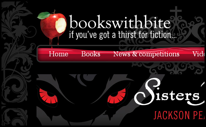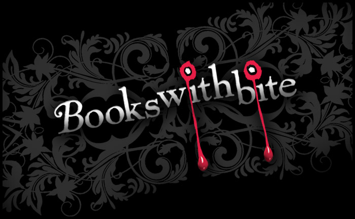
When I first designed the Books With Bite site Hachette didn’t have a logo ready, so I quickly mocked one up (below) and they were happy to keep it. Now the in-house team have a new logo, made from one of the cover illustrations and the house fonts Goudy Old Style and some other funky distressed font called “Beach”. The new logo fits the site really well and still has dripping blood to fill the “glass vial” nav panel, though I think my treatment was more sublte ; )
